
Choosing makeup online can feel strangely difficult.
A lipstick may look like the perfect muted rose in a product photograph but turn noticeably orange once you apply it. A blush that looks subtle on someone else may become surprisingly bright on your complexion. Even neutral eyeshadow can appear warmer or cooler depending on the person wearing it.
Part of the reason is simple: color doesn’t exist in isolation. The way a makeup shade appears is influenced by the coloring around it, including the skin, eyes, hair and the natural level of contrast in the face.
That has led more people to use selfies and digital tools as a starting point for choosing beauty colors. But how much can a photograph actually tell you?
What Can You Learn From Your Natural Coloring?
When people shop for foundation, they are often introduced to the idea of undertone. You might have heard descriptions such as warm, cool or neutral.
That is useful, but undertone is only one part of the picture.
There are several color characteristics that can influence whether a lipstick, blush or eyeshadow looks harmonious.
Temperature
Colors can lean warmer or cooler.
Peach, coral, terracotta and golden brown generally sit on the warmer side of the spectrum, while raspberry, mauve, blue-red and cooler taupes sit toward the cooler side.
Comparing those colors against the face can sometimes reveal that one family looks more naturally connected to your coloring.
Depth
Depth describes how light or dark a color appears.
Someone with relatively light overall coloring may prefer makeup that does not create an extreme jump in depth, while another person may find that pale shades disappear and richer colors create better balance.
This doesn’t mean dark lipstick is forbidden for someone with light coloring. It simply explains why the same lipstick can create a very different level of drama on two people.
Intensity
There is also a difference between clear, saturated colors and softer, more muted ones.
Think of the difference between vivid fuchsia and dusty rose.
Both are pink, but they behave very differently against the face.
Some people find clear colors refreshing, while others notice that those same shades seem to overpower their features. Muted coloring can have the opposite effect.
Contrast
Finally, consider how much natural contrast exists between your skin, hair, brows and eyes.
Higher contrast can sometimes support stronger separation between makeup colors, while lower-contrast coloring may feel more balanced with softer transitions.
Again, these are useful observations rather than strict rules.
Where Selfies Come Into It
A photograph provides a convenient way to look at several of these characteristics together.
You can compare the apparent temperature of the complexion, the depth of the features and the amount of contrast between areas such as the hair and skin.
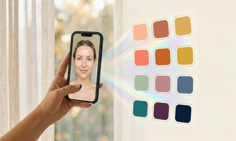
Online tools have also made this type of experimentation easier. A photo-based AI color analysis can use selfies to estimate characteristics such as warm versus cool coloring, overall contrast, and whether someone may be better suited to clearer or softer colors.
The important word, however, is estimate.
A camera is looking at a photograph of your coloring rather than seeing your coloring directly.
That distinction matters.
Why Lighting Can Completely Change the Result
Take a selfie beside a window during the middle of the day and then take another under a warm bedside lamp at night.
Your skin may appear noticeably different.
Artificial lighting can introduce yellow, orange, green or even blue casts. Direct sunlight can add warmth and strong shadows, while mixed indoor and outdoor lighting can make color even harder to judge.
Phone cameras create another variable.
Modern smartphones automatically adjust white balance, exposure, contrast and sometimes skin appearance. Beauty filters and social-media cameras can alter the image further.
A photo-based color assessment is therefore only as useful as the photograph it receives.
How to Take a Better Photo for Color Analysis
If you want to experiment with your coloring using photographs, keep the setup simple.
Start with indirect natural daylight. Standing near a window usually works better than standing in direct sunlight because harsh sun creates highlights and shadows across the face.
Turn off nearby artificial lights so the camera is not trying to balance several different light sources.
Avoid filters, beauty modes and obvious color correction.
It is also helpful to wear a white, grey or otherwise neutral top. Strongly colored clothing can reflect subtle color onto the skin and influence how the camera interprets the image.
Keep the background reasonably neutral for the same reason.
Finally, take more than one photograph.
One image can easily be misleading. If several photographs taken in consistent lighting produce similar observations, you have a more useful starting point.
What Does This Mean for Makeup?
The real value of understanding your coloring isn’t receiving a label.
It is making shopping easier.
Suppose you repeatedly notice that cooler colors seem more balanced against your complexion.
Instead of randomly choosing among twenty pink lipsticks, you might begin by comparing rose, raspberry and blue-based pinks against warmer peach or coral alternatives.
If softer colors consistently look more harmonious, you might explore muted mauves, dusty roses, taupes and softened berry shades before reaching for highly saturated alternatives.
The same thinking can be applied across your makeup bag.
Choosing Blush
Blush is an easy place to experiment because it sits directly against the complexion.
Compare similar shades rather than completely different colors.
For example:
- peach versus cool pink;
- coral versus raspberry;
- warm rose versus mauve;
- clear pink versus dusty rose.
Apply each lightly and look at your whole face.
Does the blush seem integrated with your complexion, or does your attention immediately go to the product?
That simple comparison can be more informative than trying to memorize a list of supposedly correct shades.
Choosing Lipstick
Lipstick offers even more variation.
Take red as an example.
A red lipstick can lean toward orange, blue, pink, brown or burgundy. It can also be very bright, relatively muted, light, medium or extremely deep.
That is why asking whether red lipstick “suits you” is not particularly helpful.
A better question is which kind of red creates the effect you want.
Once you understand the color characteristics you tend to prefer, narrowing down the options becomes considerably easier.
Choosing Eye Makeup
Your best eyeshadow doesn’t necessarily need to match your eye color.
You can instead think about temperature, depth and contrast.
Soft taupes and muted browns can create a subtle effect. Bronze and copper introduce warmth. Mauves and cooler browns move in another direction, while jewel tones and deeper shades produce much stronger contrast.
Your natural coloring can give you a starting point, but the occasion and the effect you want still matter.
What a Photo Cannot Tell You Perfectly
There are limits to any analysis based on a screen.
A photograph captures one lighting environment, one camera interpretation and one moment.
An in-person color consultation can physically compare different colors against the face while controlling the surrounding conditions. That provides information a casual selfie cannot perfectly reproduce.
Digital analysis should therefore be treated as a convenient way to generate ideas rather than a final authority on what you are allowed to wear.
It may point you toward colors worth trying.
The final test is still what happens when you actually put those colors on.
Use the Result as an Experiment
If a photo analysis suggests that you lean cool and muted, don’t replace your entire makeup collection the next morning.
Test the idea.
Compare one muted rose lipstick against a bright coral.
Compare a cool pink blush against a peach one.
Try a soft taupe eye look beside a warmer bronze.
Then look at the overall effect.
Do your features appear clearer? Does your complexion look more even? Does the makeup seem connected to you rather than sitting separately on your face?
You may confirm the original suggestion, discover that you sit somewhere between categories or simply learn that you prefer a completely different aesthetic.
All three outcomes are useful.
Personal Color Should Make Beauty More Flexible, Not Less
Color analysis is most helpful when it reduces guesswork.
It can give you a better starting point when choosing lipstick, blush, clothing, jewelry or hair color. Digital tools and selfies have simply made experimenting with those ideas more accessible.
But no photograph, app or seasonal label needs to become a beauty rulebook.
Use what helps.
Ignore what doesn’t.
And if knowing why certain colors work makes your makeup bag smaller, more coordinated and easier to use, then the experiment has already done its job.